eZ Components - Graph
Table of Contents
Introduction
The Graph component enables you to create line, pie and bar charts. The output driver mechanism allows you to create different image types from each chart, and the available renderers make the chart output customizable from simple two-dimensional charts to beautiful three-dimensional data projections.
ezcGraph separates different parts of the graph into chart elements, each representing one part of a graph. Elements include the title, the legend or an axis, and are all independently configurable. This design not only allows you to use different colors or fonts for each chart element, but also to define their position and size. The main chart elements are the same for all chart types. To define overall layouts for graphs, you can use palettes, which specify default colors, symbols, fonts and spacings.
Data is provided through ezcGraphDataSet objects, which are normally created from simple arrays. You also can perform statistical operations on data, as you will see later.
Class overview
This section gives you an overview of the most important classes.
- ezcGraphChart
- Line, bar and pie charts extend this abstract class, which represents the chart to be rendered. ezcGraphChart collects the data and chart elements, gives you access to all configuration settings and calls the driver and renderer for creating the final output.
- ezcGraphDataSet
- All datasets extend this abstract class to provide the data in a general form accessible by the chart.
- ezcGraphChartElement
- All chart elements store configuration values that define their layout. An element's layout definition contains background, border, margin, padding and font configuration. ezcGraphChartElement is extended by other classes for the legend, text, background and different axis types.
- ezcGraphChartElementAxis
- This class extends ezcGraphChartElement and is the base class for all axes. There are different axis types for different data to be displayed, such as numeric axis, string labeled axis or date axis.
- ezcGraphAxisLabelRenderer
- This class defines the rendering algorithm for labels and grids on an axis. The distinction between algorithms is necessary, because bar charts have labels placed directly below the data point, but numerical data in line charts should be placed next to the grid.
- ezcGraphPalette
- ezcGraphPalette contains color, font, symbol and spacing definitions to be applied to the entire graph.
- ezcGraphRenderer
- This renderer transforms chart primitives, like pie chart segments, legend or data lines, to image primitives. You have the choice between a two- and three-dimensional renderer.
- ezcGraphDriver
- This driver renders image primitives to an image. The default driver will output as SVG, but you can also render JPEGs or PNGs using ext/gd.
Chart types
Pie charts
The following is a simple example of how to create a pie chart using the default driver, palette and renderer.
- <?php
- require_once 'tutorial_autoload.php';
- $graph = new ezcGraphPieChart();
- $graph->title = 'Access statistics';
- $graph->data['Access statistics'] = new ezcGraphArrayDataSet( array(
- 'Mozilla' => 19113,
- 'Explorer' => 10917,
- 'Opera' => 1464,
- 'Safari' => 652,
- 'Konqueror' => 474,
- ) );
- $graph->data['Access statistics']->highlight['Opera'] = true;
- $graph->render( 400, 150, 'tutorial_simple_pie.svg' );
- ?>
Simply create a new chart object, optionally set a title for the chart, assign the data and render it. To assign data, the dataset container is accessed like an array to define an identifier for the dataset. The dataset in this example is created from an array, where the keys are used as the identifiers for the data points.
Pie charts accept only one dataset, and the data point identifiers are used to create the legend. To generate the output, the default SVG renderer is used with the default 2D renderer. By default, the colors are applied from the Tango palette, from the Tango Desktop Project: http://tango.freedesktop.org/Tango_Desktop_Project
Several dataset and data point presentation styles will be mentioned in this tutorial. One possibility is to highlight a special dataset or point. In line 15, the data point Opera is highlighted; in the case of pie charts, this segment is pulled away from the center. See the renderer options class ezcGraphRendererOptions for more details.
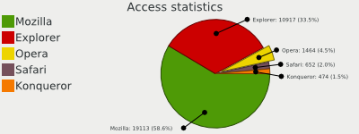 Sample pie chart
Pie chart options
There are several pie chart specific configuration options available. In eZ Components, options are always accessed via public properties. For a full list of all available options, see the documentation for the ezcGraphPieChartOptions class.
- <?php
- require_once 'tutorial_autoload.php';
- $graph = new ezcGraphPieChart();
- $graph->title = 'Elections 2005 Germany';
- $graph->data['2005'] = new ezcGraphArrayDataSet( array(
- 'CDU' => 35.2,
- 'SPD' => 34.2,
- 'FDP' => 9.8,
- 'Die Gruenen' => 8.1,
- 'PDS' => 8.7,
- 'NDP' => 1.6,
- 'REP' => 0.6,
- ) );
- $graph->options->label = '%3$.1f%%';
- $graph->options->sum = 100;
- $graph->options->percentThreshold = 0.02;
- $graph->options->summarizeCaption = 'Others';
- $graph->render( 400, 150, 'tutorial_pie_options.svg' );
- ?>
In line 16, a sprintf format string is set, which defines how the labels are formatted. Instead of a sprintf format string, you could also set a callback function to do label formatting.
In this example, we set a custom sum to force the pie chart to show the complete 100%. The percentThreshold lets the chart collect all data points that have less than the specified percentage to be aggregated in one data point. We also could define an absolute threshold, so that all data below a certain value would be aggregated in one data point. summarizeCaption defines the caption for this aggregated dataset.
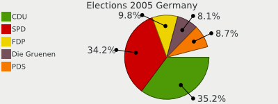 Pie chart configuration options
Line charts
Line charts are created in the same way as pie charts, but they accept more than one dataset. We are using the default driver, palette and renderer in this example.
- <?php
- require_once 'tutorial_autoload.php';
- $wikidata = include 'tutorial_wikipedia_data.php';
- $graph = new ezcGraphLineChart();
- $graph->title = 'Wikipedia articles';
- // Add data
- foreach ( $wikidata as $language => $data )
- {
- $graph->data[$language] = new ezcGraphArrayDataSet( $data );
- }
- $graph->render( 400, 150, 'tutorial_line_chart.svg' );
- ?>
There are only two differences compared to the last example. In line 6, we instantiate a ezcGraphLineChart object instead of ezcGraphPieChart and beginning in line 10, we assign multiple datasets from an array we included earlier in the script. The array in the file tutorial_wikipedia_data.php is built like this:
- <?php
- return array(
- 'English' => array(
- 'Jan 2006' => 965,
- 'Feb 2006' => 1000,
- ...
- ),
- ...
- ); ?>
The result is a simple, default line chart.
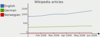 Simple line chart
Bar charts
Bar charts are very similar to line charts. They accept the same datasets and only define another default dataset display type and axis label renderer.
- <?php
- require_once 'tutorial_autoload.php';
- $wikidata = include 'tutorial_wikipedia_data.php';
- $graph = new ezcGraphBarChart();
- $graph->title = 'Wikipedia articles';
- // Add data
- foreach ( $wikidata as $language => $data )
- {
- $graph->data[$language] = new ezcGraphArrayDataSet( $data );
- }
- $graph->render( 400, 150, 'tutorial_bar_chart.svg' );
- ?>
As you can see in line 6, we only change the chart constructor, and the other default values are applied.
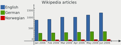 Simple bar chart
Lots of bars
By default, ezcGraph reduces the amount of steps shown on an axis to about 10 steps. This may cause unexpected results when trying to draw a bar chart with more than 10 bars in one dataset. You may override the behaviour by manually setting the amount of steps on the x axis:
- <?php
- // Initialize graph ...
- $graph->xAxis->labelCount = count( $chart->data['name'] );
- // Output graph ... ?>
This works because all datasets implement the Countable interface. If you want to use it for more than one dataset, you could do the following:
- <?php
- // Initialize graph ...
- $chart->xAxis->labelCount = max(
- count( $chart->data['name 1'] ),
- count( $chart->data['name 2'] )
- );
- // Output graph ... ?>
Combining bar and line charts
The only difference between bar and line charts is the display type of the dataset and the axis label renderer of the x-axis. You can use one of those constructors and modify your chart to display one or more datasets in either display type. The axis label renderer is described later in this tutorial.
- <?php
- require_once 'tutorial_autoload.php';
- $wikidata = include 'tutorial_wikipedia_data.php';
- $graph = new ezcGraphBarChart();
- $graph->title = 'Wikipedia articles';
- // Add data
- foreach ( $wikidata as $language => $data )
- {
- $graph->data[$language] = new ezcGraphArrayDataSet( $data );
- }
- $graph->data['German']->displayType = ezcGraph::LINE;
- $graph->options->fillLines = 210;
- $graph->render( 400, 150, 'tutorial_bar_line_chart.svg' );
- ?>
After creating the datasets we modify one of the datasets in line 14 to change the default display type to ezcGraph::LINE. To more prominently display the line, we set one graph option in line 16. Options are accessed like public properties and in this case we set an option for the graph called "fillLines", which indicates what transparency value is used to fill the space underneath the line.
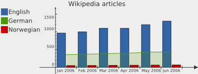 Combined bar and line chart
More bar chart options
There are some more options available for line and bar charts, which configure the highlighting of datasets.
- <?php
- require_once 'tutorial_autoload.php';
- $wikidata = include 'tutorial_wikipedia_data.php';
- $graph = new ezcGraphBarChart();
- $graph->title = 'Wikipedia articles';
- // Add data
- foreach ( $wikidata as $language => $data )
- {
- $graph->data[$language] = new ezcGraphArrayDataSet( $data );
- }
- $graph->data['German']->displayType = ezcGraph::LINE;
- $graph->data['German']->highlight = true;
- $graph->data['German']->highlight['Mar 2006'] = false;
- $graph->options->fillLines = 210;
- $graph->options->highlightSize = 12;
- $graph->options->highlightFont->background = '#EEEEEC88';
- $graph->options->highlightFont->border = '#000000';
- $graph->options->highlightFont->borderWidth = 1;
- $graph->render( 400, 150, 'tutorial_bar_options.svg' );
- ?>
In line 20, the size of the highlight boxes is specified and lines 22 to 24 change the font configuration for the highlight boxes. Highlighting works in much the same way as for pie charts, but in line and bar charts it makes sense to highlight a complete dataset instead of only one single data point. This is because there is usually more than one dataset in line and bar charts.
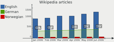 Configured highlight in combined line and bar chart
Stacked bar charts
In stacked bar charts, the bars are not drawn next to each other, but aggregated in one bar, and the overall bar consumes the space of the sum of all single bars.
- <?php
- require_once 'tutorial_autoload.php';
- $wikidata = include 'tutorial_wikipedia_data.php';
- $graph = new ezcGraphBarChart();
- $graph->title = 'Wikipedia articles';
- // Stack bars
- $graph->options->stackBars = true;
- // Add data
- foreach ( $wikidata as $language => $data )
- {
- $graph->data[$language] = new ezcGraphArrayDataSet( $data );
- }
- $graph->yAxis->label = 'Thousand articles';
- $graph->render( 400, 150, 'tutorial_stacked_bar_chart.svg' );
- ?>
To use stacked bar charts, you only need to set the option $stackBars to "true". In the 3D renderer this will cause all bars to be rendered with the symbol ezcGraph::NO_SYMBOL.
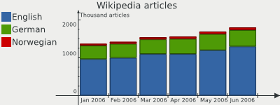 Bar chart with stacked bars
Radar charts
Radar charts are very similar to line charts, but only with one axis, which will be drawn multiple times, rotated around the center point of the chart.
- <?php
- require_once 'tutorial_autoload.php';
- $wikidata = include 'tutorial_wikipedia_data.php';
- $graph = new ezcGraphRadarChart();
- $graph->title = 'Wikipedia articles';
- $graph->options->fillLines = 220;
- // Add data
- foreach ( $wikidata as $language => $data )
- {
- $graph->data[$language] = new ezcGraphArrayDataSet( $data );
- $graph->data[$language][] = reset( $data );
- }
- $graph->render( 400, 150, 'tutorial_radar_chart.svg' );
- ?>
This again is one of the simplest ways to create a radar chart. Nearly all options described later are also available in radar charts. The basic difference is that an ezcGraphRadarChart object is created in line 6. Radar charts accept multiple datasets, like bar and line charts. In line 14 the first element of the dataset is reassigned as the last element to close the circle. By not reassigning this value, you can get a radar chart where the tails do not join.
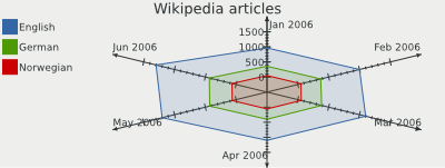 Simple radar chart
Controlling radar axis
Instead of having an x and a y axis, the radar chart has a main axis, which is the equivalent to the y axis in the other charts, and a rotation axis, the equivalent of the x axis. The steps on the rotation axis define the positions of the rotated main axis. This way you may use all available datasets and axes.
- <?php
- require_once 'tutorial_autoload.php';
- $wikidata = include 'tutorial_wikipedia_data.php';
- $graph = new ezcGraphRadarChart();
- $graph->palette = new ezcGraphPaletteEzBlue();
- $graph->options->fillLines = 220;
- $graph->legend->position = ezcGraph::BOTTOM;
- $graph->rotationAxis = new ezcGraphChartElementNumericAxis();
- $graph->rotationAxis->majorStep = 2;
- $graph->rotationAxis->minorStep = .5;
- mt_srand( 5 );
- $data = array();
- for ( $i = 0; $i <= 10; $i++ )
- {
- $data[$i] = mt_rand( -5, 5 );
- }
- $data[$i - 1] = reset( $data );
- $graph->data['random data'] = $dataset = new ezcGraphArrayDataSet( $data );
- $average = new ezcGraphDataSetAveragePolynom( $dataset, 4 );
- $graph->data[(string) $average->getPolynom()] = $average;
- $graph->data[(string) $average->getPolynom()]->symbol = ezcGraph::NO_SYMBOL;
- $graph->data[(string) $average->getPolynom()]->color = '#9CAE86';
- $graph->render( 500, 250, 'tutorial_complex_radar_chart.svg' );
- ?>
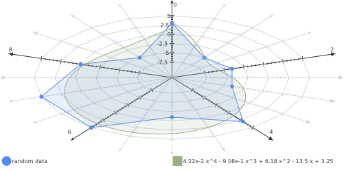
The settings on the graph will be explained later in the tutorial in detail. In line 11 the type of the rotation axis is set to a numeric axis, which is explained in Chart elements -> Axis.
For line 15 to 23, a dataset is added with some random data. Using this data as a base, a new dataset is built, which calculates a polynomial interpolation function. This is described in more detail in the section Datasets -> Average polynomial dataset. Lastly, the default colors and symbols from the palette are modified.
 Complex radar chart
The resulting radar chart shows how minor steps on the rotation axis are drawn as a grayed out axis and major steps as a regular axis. Note that all types of datasets can be drawn using radar charts.
Odometer charts
Odometer charts can display values on one bar with a gradient and markers, providing a nice way for the viewer to detect where a value is in a defined bounding.
- <?php
- require_once 'tutorial_autoload.php';
- $graph = new ezcGraphOdometerChart();
- $graph->title = 'Sample odometer';
- $graph->options->font->maxFontSize = 12;
- $graph->data['data'] = new ezcGraphArrayDataSet(
- array( 1, 3, 9 )
- );
- $graph->render( 400, 150, 'tutorial_odometer_chart.svg' );
- ?>
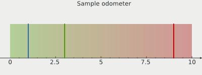
As you can see from the example, the odometer basically behaves like other chart types. First we create an object of the class ezcGraphOdometerChart, then a title and a dataset is assigned, as per usual. Similar to pie charts, an odometer only accepts one dataset. A legend does not exist for odometers - and you may of course assign an array dataset, containing only one element.
 Simple odometer
The result is a bar, filled with the default gradient, with markers as indicators for the values on the bar. The axis span is automatically calculated for the provided values - you can modify them as usual, but take a look at the next example for this.
Custom odometer chart
When using only one value on an odometer chart, you may wish to manually configure the span on the axis. You can do this as you normally would with any other axis.
- <?php
- require_once 'tutorial_autoload.php';
- $graph = new ezcGraphOdometerChart();
- $graph->title = 'Custom odometer';
- $graph->data['data'] = new ezcGraphArrayDataSet(
- array( 87 )
- );
- // Set the marker color
- $graph->data['data']->color[0] = '#A0000055';
- // Set colors for the background gradient
- $graph->options->startColor = '#2E3436';
- $graph->options->endColor = '#EEEEEC';
- // Define a border for the odometer
- $graph->options->borderWidth = 2;
- $graph->options->borderColor = '#BABDB6';
- // Set marker width
- $graph->options->markerWidth = 5;
- // Set space, which the odometer may consume
- $graph->options->odometerHeight = .7;
- // Set axis span and label
- $graph->axis->min = 0;
- $graph->axis->max = 100;
- $graph->axis->label = 'Coverage ';
- $graph->render( 400, 150, 'tutorial_custom_odometer_chart.svg' );
- ?>
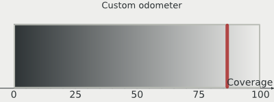
In this example we only assign one value, so we get one marker on the odometer. The we start using the configuration options for odometers, defined in the ezcGraphOdometerChartOptions class.
The start and end color define the colors used for the background gradient. The border options define the border, which is drawn around the chart gradient. After this you can configure the width of the markers, and the space used for the actual odometer.
We then configure the minimum and maximum values for the axis and a label for the axis.
 Custom configured odometer
Palettes
ezcGraph offers graph palettes to define the overall style properties of chart elements. The style properties are similar to those from CSS:
color
background color
border color
border width
padding
margin
dataset symbols
There are several predefined palettes in ezcGraph, but you can easily modify them or create your own palettes.
Using a predefined palette
You can assign each class extending ezcGraphPalette to the palette property of your graph. You should do this before adding datasets, because the datasets request colors from the palette. If you set the palette after creating the datasets, the datasets will still use the colors from the default palette.
- <?php
- require_once 'tutorial_autoload.php';
- $wikidata = include 'tutorial_wikipedia_data.php';
- $graph = new ezcGraphBarChart();
- $graph->palette = new ezcGraphPaletteBlack();
- $graph->title = 'Wikipedia articles';
- // Add data
- foreach ( $wikidata as $language => $data )
- {
- $graph->data[$language] = new ezcGraphArrayDataSet( $data );
- }
- $graph->data['German']->displayType = ezcGraph::LINE;
- $graph->options->fillLines = 210;
- $graph->render( 400, 150, 'tutorial_user_palette.svg' );
- ?>
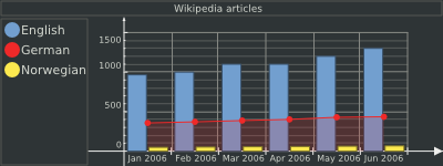
The generated output differs quite a lot from the output using the default Tango palette. The colors for the background, datasets and fonts have been changed. Additionally, the palette sets a color for the major and minor grid, and defines a border width and color for the chart elements. The palette defaults to a sans-serif font and increases the margin between the chart elements.
 Combined bar / line chart with non default palette
You can find a complete list of the available palettes in the class tree.
Modifying a palette
In the last example, we assigned a palette object to the palette property of the graph. You can of course create and modify the object before assigning it.
- <?php
- require_once 'tutorial_autoload.php';
- require_once 'tutorial_custom_palette.php';
- $wikidata = include 'tutorial_wikipedia_data.php';
- $graph = new ezcGraphBarChart();
- $graph->palette = new tutorialCustomPalette();
- $graph->title = 'Wikipedia articles';
- // Add data
- foreach ( $wikidata as $language => $data )
- {
- $graph->data[$language] = new ezcGraphArrayDataSet( $data );
- }
- $graph->data['German']->displayType = ezcGraph::LINE;
- $graph->options->fillLines = 210;
- $graph->render( 400, 150, 'tutorial_modified_palette.svg' );
- ?>
The palette object is created in line 6 and we overwrite some of its properties. An overview on all available properties can be found in the class documentation for the abstract class ezcGraphPalette. In this example we just set two colors for the automatic colorization of the datasets and three symbols for datasets.
Since we assign more than two datasets, the first assigned color will be reused for the third dataset. You can see the usage of the symbols in the legend and on the line chart. The line chart displays a symbol for each data point if the symbol is set to something other than ezcGraph::NO_SYMBOL.
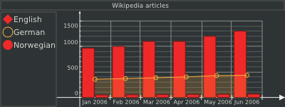 Combined bar / line chart with modified palette
Creating a custom palette
To style the graphs to fit a custom look, such as a corporate identity, the easiest way is to create your own palette. To create a custom palette you can either extend one of the predefined palettes and overwrite their properties or extend the abstract palette class.
- <?php
- class tutorialCustomPalette extends ezcGraphPalette
- {
- protected $axisColor = '#000000';
- protected $majorGridColor = '#000000BB';
- protected $dataSetColor = array(
- '#4E9A0688',
- '#3465A4',
- '#F57900'
- );
- protected $dataSetSymbol = array(
- ezcGraph::BULLET,
- );
- protected $fontName = 'sans-serif';
- protected $fontColor = '#555753';
- }
- ?>
Each undefined color will default to a transparent white. As you can see in the example definition, you can define alpha values beside the normal RGB values for the colors. After creating a custom palette, you can use it like any predefined palette, as previously explained.
- <?php
- require_once 'tutorial_autoload.php';
- require_once 'tutorial_custom_palette_palette.php';
- $wikidata = include 'tutorial_wikipedia_data.php';
- $graph = new ezcGraphBarChart();
- $graph->palette = new tutorialCustomPalette();
- $graph->title = 'Wikipedia articles';
- // Add data
- foreach ( $wikidata as $language => $data )
- {
- $graph->data[$language] = new ezcGraphArrayDataSet( $data );
- }
- $graph->data['German']->displayType = ezcGraph::LINE;
- $graph->options->fillLines = 210;
- $graph->render( 400, 150, 'tutorial_custom_palette.svg' );
- ?>
The example now uses the custom palette to format the output. You can include palettes using your application's autoload mechanism or require them as shown in the example above.
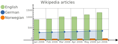 Combined bar / line chart with custom palette
Chart elements
The chart elements all extend ezcGraphChartElement. Each of the elements can be configured independently. A default chart consists of the following elements:
title
background
legend
xAxis
yAxis
The palette defines the default formatting of the elements. Not only can you set foreground and background colors for all the elements, but you can also define their position in the chart or prevent them from being rendered at all.
Font configuration
We try to fulfill two goals regarding font configuration. First, there should be a single point to configure the fonts used for the text areas in the chart. On the other hand, it should be possible to configure the fonts independently for each chart element.
The solution is that you can modify the global font configuration by accessing $graph->options->font. This takes effect on all chart elements unless you intentionally access the font configuration of an individual chart element. The following example shows how this works.
- <?php
- require_once 'tutorial_autoload.php';
- $graph = new ezcGraphPieChart();
- $graph->palette = new ezcGraphPaletteEzBlue();
- $graph->title = 'Access statistics';
- // Set the maximum font size to 8 for all chart elements
- $graph->options->font->maxFontSize = 8;
- // Set the font size for the title independently to 14
- $graph->title->font->maxFontSize = 14;
- // The following only affects all elements except the // title element,
- // which now has its own font configuration.
- $graph->options->font->name = 'serif';
- $graph->data['Access statistics'] = new ezcGraphArrayDataSet( array(
- 'Mozilla' => 19113,
- 'Explorer' => 10917,
- 'Opera' => 1464,
- 'Safari' => 652,
- 'Konqueror' => 474,
- ) );
- $graph->render( 400, 150, 'tutorial_chart_font_configuration.svg' );
- ?>
The output of the example shows, that all texts are using a serif font, while the title still stays with the default sans-serif font.
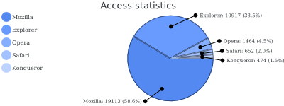 Font configuration in pie chart
The chart title
The chart title element will only be rendered if you manually assign a title. It can be placed on top or at the bottom of the chart.
- <?php
- require_once 'tutorial_autoload.php';
- $graph = new ezcGraphPieChart();
- $graph->palette = new ezcGraphPaletteEzBlue();
- $graph->title = 'Access statistics';
- $graph->options->font->name = 'serif';
- $graph->title->background = '#EEEEEC';
- $graph->title->font->name = 'sans-serif';
- $graph->options->font->maxFontSize = 8;
- $graph->data['Access statistics'] = new ezcGraphArrayDataSet( array(
- 'Mozilla' => 19113,
- 'Explorer' => 10917,
- 'Opera' => 1464,
- 'Safari' => 652,
- 'Konqueror' => 474,
- ) );
- $graph->render( 400, 150, 'tutorial_chart_title.svg' );
- ?>
The chart title is the simplest element. In line 9, we change the global font configuration to use a serif font. In the SVG renderer, only the font name is relevant, because it is up to the client to actually render the bitmap from the defined vector definitions.
In line 11, we access the font configuration of the title element and change it back to use a sans-serif font. From now on, no change on the global font configuration will affect the title's font configuration. In line 14, we set a maximum font size, which now only affects the legend and the pie chart captions.
Aside from the font configuration, we set an option for all chart elements in line 11 - the background color of the current element. This results in a gray background for the title element only.
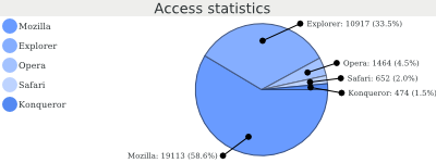 Font and title configuration in pie chart
The background element
With all drivers except the Ming (Flash) driver, you can set background images with the option to repeat them in the same way as in CSS definitions.
- <?php
- require_once 'tutorial_autoload.php';
- $graph = new ezcGraphPieChart();
- $graph->palette = new ezcGraphPaletteEzRed();
- $graph->title = 'Access statistics';
- $graph->data['Access statistics'] = new ezcGraphArrayDataSet( array(
- 'Mozilla' => 19113,
- 'Explorer' => 10917,
- 'Opera' => 1464,
- 'Safari' => 652,
- 'Konqueror' => 474,
- ) );
- $graph->background->image = 'ez.png';
- $graph->background->position = ezcGraph::BOTTOM | ezcGraph::RIGHT;
- $graph->background->repeat = ezcGraph::NO_REPEAT;
- $graph->render( 400, 150, 'tutorial_chart_background.svg' );
- ?>
In line 17, we set a background image, and define its position in line 18. You can use every combination of bottom / center / top with left / middle / right here, and it defaults to center | middle. In line 19, you set the type of repetition of the background image. This can be ezcGraph::NO_REPEAT or a combination of ezcGraph::HORIZONTAL and ezcGraph::VERTICAL. In this case, we just want a logo to be placed at the bottom right corner of the image.
With the SVG driver, the image is inlined using a data URL with the base64 encoded content of the binary image file. Using this driver, you do not need to worry about the locations of your referenced images.
With the GD driver, super sampling is not applied to the images, as this would make them blurry.
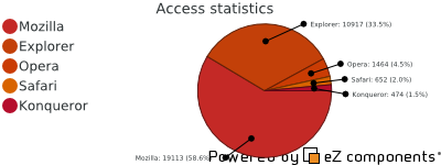 Pie chart with logo in background
Of course, you could also apply the following settings to the background element: background color, borders, margins and padding.
The legend
The legend is shown by default and is automatically generated from the assigned data. If you want to disable the legend, you can do this by setting it to "false" (line 9).
- <?php
- require_once 'tutorial_autoload.php';
- $graph = new ezcGraphPieChart();
- $graph->palette = new ezcGraphPaletteEzGreen();
- $graph->title = 'Access statistics';
- $graph->legend = false;
- $graph->data['Access statistics'] = new ezcGraphArrayDataSet( array(
- 'Mozilla' => 19113,
- 'Explorer' => 10917,
- 'Opera' => 1464,
- 'Safari' => 652,
- 'Konqueror' => 474,
- ) );
- $graph->render( 400, 150, 'tutorial_chart_legend.svg' );
- ?>
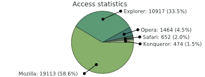 Pie chart without legend
Legend configuration options
Other than hiding the legend, you can also place it at the bottom, left or top in the chart; you can assign a title for the legend and change the symbol sizes; you can additionally set the legend size.
- <?php
- require_once 'tutorial_autoload.php';
- $graph = new ezcGraphPieChart();
- $graph->palette = new ezcGraphPaletteEz();
- $graph->title = 'Access statistics';
- $graph->data['Access statistics'] = new ezcGraphArrayDataSet( array(
- 'Mozilla' => 19113,
- 'Explorer' => 10917,
- 'Opera' => 1464,
- 'Safari' => 652,
- 'Konqueror' => 474,
- ) );
- $graph->legend->position = ezcGraph::BOTTOM;
- $graph->legend->landscapeSize = .3;
- $graph->legend->title = 'Legend';
- $graph->render( 400, 150, 'tutorial_legend_options.svg' );
- ?>
To place the legend at another position on the graph, set the position property of the legend, as shown in line 17. If the legend is placed at the top or bottom, it will automatically use a landscape format. The space consumed by the legend is configured by the landscapeSize setting for landscape-oriented legends and the portraitSize setting otherwise. The assigned value is the percent portion of space taken up by the legend, relative to the size of the chart. The legend only displays a title if you manually set it, as shown in line 19.
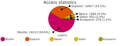 Legend configuration example
Axis
The axis defines the unit scale in line and bar charts. There are always two axes - the x-axis and the y-axis, whose ranges are automatically received from the datasets and scaled to display appropriate values.
There are different types of values to display for both the x-axis and the y-axis. ezcGraph supports different axis types for different types of data. For normal string keys, the standard labeled axis is usually the right choice. The numeric axis is predestined to display numeric data, and the date time axis is for data associated with dates or times. All of the axis types can be assigned to either axis.
Labeled axes
The labeled axis is default for the x-axis in both bar and line charts. It is intended to display string labels of datasets and uses the centered label renderer by default. You saw it in all the earlier examples with bar and line charts, but it can be used for both axes as well.
- <?php
- require_once 'tutorial_autoload.php';
- $wikidata = include 'tutorial_wikipedia_data.php';
- $graph = new ezcGraphLineChart();
- $graph->options->fillLines = 210;
- $graph->options->font->maxFontSize = 10;
- $graph->title = 'Error level colors';
- $graph->legend = false;
- $graph->yAxis = new ezcGraphChartElementLabeledAxis();
- $graph->yAxis->axisLabelRenderer->showZeroValue = true;
- $graph->yAxis->label = 'Color';
- $graph->xAxis->label = 'Error level';
- // Add data
- $graph->data['colors'] = new ezcGraphArrayDataSet(
- array(
- 'info' => 'blue',
- 'notice' => 'green',
- 'warning' => 'orange',
- 'error' => 'red',
- 'fatal' => 'red',
- )
- );
- $graph->render( 400, 150, 'tutorial_axis_labeled.svg' );
- ?>
You could argue whether such a chart is really useful - but it works. Instead of using numeric values, colors are assigned when creating the dataset. The labeled axis uses the values in the order they are assigned. Line 11 is the first time we actually configure the axis label renderer. The axis label renderer describes how the labels are placed on the axis - the labeled axis uses the centered axis label renderer by default, which places the labels centered next to the steps on the axis. The setting in line 11 forces the renderer to show the zero value, even though it interferes with the axis.
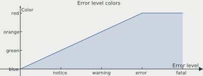 Two labeled axes
Numeric axis
The numeric axis is the default for the y-axis. It displays numeric data and automatically determines appropriate scaling for the assigned values. However, you can also configure all scaling parameters manually.
- <?php
- require_once 'tutorial_autoload.php';
- $wikidata = include 'tutorial_wikipedia_data.php';
- $graph = new ezcGraphLineChart();
- $graph->title = 'Some random data';
- $graph->legend = false;
- $graph->xAxis = new ezcGraphChartElementNumericAxis();
- $graph->xAxis->min = -15;
- $graph->xAxis->max = 15;
- $graph->xAxis->majorStep = 5;
- $data = array(
- array(),
- array()
- );
- for ( $i = -10; $i <= 10; $i++ )
- {
- $data[0][$i] = mt_rand( -23, 59 );
- $data[1][$i] = mt_rand( -23, 59 );
- }
- // Add data
- $graph->data['random blue'] = new ezcGraphArrayDataSet( $data[0] );
- $graph->data['random green'] = new ezcGraphArrayDataSet( $data[1] );
- $graph->render( 400, 150, 'tutorial_axis_numeric.svg' );
- ?>
In this example, we force both axes to be numeric axes in line 10. In lines 12 to 15, we manually set the scaling options for the x-axis. We do not set a minorStep size here, so it will be automatically calculated from the other values, as will the settings for the y-axis. Then, we create some random data and create two datasets from it as usual.
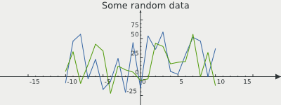 Two numeric axes with random data
The example shows one advantage of a numeric axis over a labeled axis for numeric data. The axes are moved away from the chart's border to display the negative values below and left of the axis.
Date time axis
Previously in this tutorial, we used a labeled axis for date time data on the x-axis in the Wikipedia examples. This works fine for evenly-distributed time spans. For other data, you should use the date time axis.
- <?php
- require_once 'tutorial_autoload.php';
- $graph = new ezcGraphLineChart();
- $graph->options->fillLines = 210;
- $graph->title = 'Concurrent requests';
- $graph->legend = false;
- $graph->xAxis = new ezcGraphChartElementDateAxis();
- // Add data
- $graph->data['Machine 1'] = new ezcGraphArrayDataSet( array(
- '8:00' => 3241,
- '8:13' => 934,
- '8:24' => 1201,
- '8:27' => 1752,
- '8:51' => 123,
- ) );
- $graph->data['Machine 2'] = new ezcGraphArrayDataSet( array(
- '8:05' => 623,
- '8:12' => 2103,
- '8:33' => 543,
- '8:43' => 2034,
- '8:59' => 3410,
- ) );
- $graph->data['Machine 1']->symbol = ezcGraph::BULLET;
- $graph->data['Machine 2']->symbol = ezcGraph::BULLET;
- $graph->render( 400, 150, 'tutorial_axis_datetime.svg' );
- ?>
You can use timestamps or date time strings as dataset keys. The strings will be converted using PHP's strtotime() function.
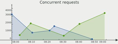 Date axis example
Axis label renderer
As mentioned earlier in this tutorial, the axis label renderer defines where a label is drawn relative to the step on the axis. You already saw examples for all available axis label renderers, but here is an overview:
ezcGraphAxisExactLabelRenderer
This is the default renderer for the numeric axis. The labels are drawn directly below the axis step. This may look strange sometimes, because it is not always possible to draw all labels of one axis on one side of the step; the last or first label would exceed the available space for the axis, and be rendered on the other side.
ezcGraphAxisCenteredLabelRenderer
This renderer is the default for the labeled axis in line charts and draws the label centered next to the step. Therefore, this renderer omits the label for the initial step on the axis (0, 0) by default. However, this can be forced as shown in the example in Axis -> Labeled axes. The label is omitted because it would interfere with the axis or the labels of the other axis, and thus be difficult to read.
ezcGraphAxisBoxedLabelRenderer
This is the default renderer for the labeled axis in bar charts. The steps on the axis and the grid are not drawn at the position of the label, but between two labels. This helps to recognize which bars belong together. Labels are rendered centered between two steps on the axis.
Rotated labels on axis
There is one more new axis label renderer since version 1.1 of ezcGraph - ezcGraphAxisRotatedLabelRenderer, which enables you to render rotated labels on an axis.
- <?php
- require_once 'tutorial_autoload.php';
- $wikidata = include 'tutorial_wikipedia_data.php';
- $graph = new ezcGraphLineChart();
- $graph->title = 'Wikipedia articles';
- $graph->xAxis->axisLabelRenderer = new ezcGraphAxisRotatedLabelRenderer();
- $graph->xAxis->axisLabelRenderer->angle = 45;
- $graph->xAxis->axisSpace = .2;
- // Add data
- foreach ( $wikidata as $language => $data )
- {
- $graph->data[$language] = new ezcGraphArrayDataSet( $data );
- }
- $graph->data['German']->displayType = ezcGraph::LINE;
- $graph->options->fillLines = 210;
- $graph->render( 400, 150, 'tutorial_rotated_labels.svg' );
- ?>
In line 9, a custom renderer is defined for the labeled x axis. You can assign custom axis label renderers on the property $axisLabelRenderer for ezcGraphChartElementAxis objects.
The renderer used in this example has custom properties like the rotation of the labels, which is set in degrees, while the rotation direction depends on the direction of the axis.
It makes sense to define more vertical space below the axis for the rotated labels as done in line 11 of the above example.
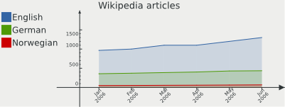 Date axis example
The results conatins rotated labels, which enables you to pack a lot more labels on one axis.
Additional axis & markers
Aside from the x axis and the y axis, you can add additional axes and markers to one chart. You can also assign these additional axes to datasets, so that some datasets use different axes than others.
Add markers to chart
First, add some markers, which only get a label and reside at some user defined position, to a chart. You may use them to display data boundings on the y axis, or important values on the x axis.
- <?php
- require_once 'tutorial_autoload.php';
- $wikidata = include 'tutorial_wikipedia_data.php';
- $graph = new ezcGraphLineChart();
- $graph->title = 'Wikipedia articles';
- // Add data
- foreach ( $wikidata as $language => $data )
- {
- $graph->data[$language] = new ezcGraphArrayDataSet( $data );
- }
- $graph->additionalAxis['border'] = $marker = new ezcGraphChartElementNumericAxis( );
- $marker->position = ezcGraph::LEFT;
- $marker->chartPosition = 1 / 3;
- $marker->label = 'One million!';
- $graph->render( 400, 150, 'tutorial_line_chart_markers.svg' );
- ?>
You can see a standard line chart, like in the examples before, using the Wikipedia datasets. In line 15 we add another axis, and configure this one in the following lines. The position of an axis defines its origin. The position ezcGraph::LEFT means that the axis starts at the left side of the graph. You can also use ezcGraph::RIGHT to make the axis start on the right.
The position of the axis may be defined by a float value, which defines the fractional position in the chart, calculated from the top left position. After this we also define a label for the axis.
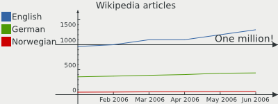 Line chart with marker
Additional axes
As previously noted, you can not only add additional axis to one chart, but you can also assign datasets to use one of these new axes. This will cause the axis to calculate its values depending on the assigned datasets and the data to orientate at the new axis.
The new axis may also be of a completely different type than the original chart axis.
- <?php
- require_once 'tutorial_autoload.php';
- $wikidata = include 'tutorial_wikipedia_data.php';
- $graph = new ezcGraphLineChart();
- $graph->title = 'Wikipedia articles';
- // Add data
- foreach ( $wikidata as $language => $data )
- {
- $graph->data[$language] = new ezcGraphArrayDataSet( $data );
- }
- $graph->yAxis->min = 0;
- // Use a different axis for the norwegian dataset
- $graph->additionalAxis['norwegian'] = $nAxis = new ezcGraphChartElementNumericAxis();
- $nAxis->position = ezcGraph::BOTTOM;
- $nAxis->chartPosition = 1;
- $nAxis->min = 0;
- $graph->data['Norwegian']->yAxis = $nAxis;
- // Still use the marker
- $graph->additionalAxis['border'] = $marker = new ezcGraphChartElementNumericAxis();
- $marker->position = ezcGraph::LEFT;
- $marker->chartPosition = 1 / 3;
- $graph->render( 400, 150, 'tutorial_line_chart_additional_axis.svg' );
- ?>
In this chart we use a different axis, positioned at the very end of the chart, for the Norwegian Wikipedia data. Due to the different scaling for the English and Norwegian data, you can easily see that the development of articles is very similar, on a completely different level.
To use the axis with some dataset, you need to assign the newly created axis to one of the existing axis properties and to the dataset. In this case we use the $yAxis property.
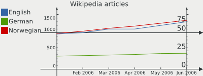 Line chart with additional axis
Datasets
Datasets receive user data and provide an interface for ezcGraph to access this data.
Array data
The array dataset was used for all examples until now, because it is the simplest way to provide data for ezcGraph.
Average polynomial dataset
The average polynomial dataset uses an existing dataset with numeric keys and builds a polynomial that interpolates the data points in the given dataset using the least squares algorithm.
- <?php
- require_once 'tutorial_autoload.php';
- $graph = new ezcGraphLineChart();
- $graph->title = 'Some random data';
- $graph->legend->position = ezcGraph::BOTTOM;
- $graph->xAxis = new ezcGraphChartElementNumericAxis();
- $data = array();
- for ( $i = 0; $i <= 10; $i++ )
- {
- $data[$i] = mt_rand( -5, 5 );
- }
- // Add data
- $graph->data['random data'] = $dataset = new ezcGraphArrayDataSet( $data );
- $average = new ezcGraphDataSetAveragePolynom( $dataset, 3 );
- $graph->data[(string) $average->getPolynom()] = $average;
- $graph->render( 400, 150, 'tutorial_dataset_average.svg' );
- ?>
Here we use two numeric axes, because we only display numeric data in this example. First, we create a normal array dataset from some randomly generated data in line 14. We assign this dataset to the chart to see how well the polynomial fits the random data points.
In line 20, we create a ezcGraphDataSetAveragePolynom dataset from the random data with a maximum polynomial degree of 3 (which is also the default value). You can directly access the polynomial when we add the dataset to the graph. The string representation of the polynomial itself is also used as the name of the dataset.
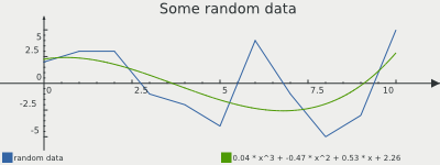 Average polynomial example
For the computation of the polynomial, an equation has to be solved where the size of the matrix is equal to the point count of the used dataset. Be careful with datasets with large point counts. This could mean that ezcGraph will consume a lot of memory and processing power.
Numeric dataset
Numeric datasets are used to represent mathematical functions in your chart. You can use callbacks to PHP functions, or your own functions or methods to define the mathematical function used to create the dataset.
- <?php
- require_once 'tutorial_autoload.php';
- $graph = new ezcGraphLineChart();
- $graph->title = 'Sinus';
- $graph->legend->position = ezcGraph::BOTTOM;
- $graph->xAxis = new ezcGraphChartElementNumericAxis();
- $graph->data['sinus'] = new ezcGraphNumericDataSet(
- -360, // Start value
- 360, // End value
- create_function(
- '$x',
- 'return sin( deg2rad( $x ) );'
- )
- );
- $graph->data['sinus']->resolution = 120;
- $graph->render( 400, 150, 'tutorial_dataset_numeric.svg' );
- ?>
The numeric dataset constructor receives the start and end values for the function's input and the function itself using PHP's callback datatype. In this example we create a function on runtime using create_function(), which returns the name of the created function (which is a valid callback). The code of the created function in line 16 returns sine values for the input in degrees.
The resolution set in line 20 defines the number of steps used to interpolate the function in your graph. You should not use a number bigger than the width of your chart.
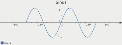 Example numeric dataset
Renderer
The renderer transforms chart primitives into image primitives. For example, a pie segment including labels, highlighting and so on will be transformed into some text strings, circle sectors and symbols to link the text to the corresponding circle sector.
ezcGraph comes with the default 2D renderer used in all of the above examples and a 3D renderer that renders the chart elements in a pseudo 3D isometric manner.
2D renderer
All examples until now used the default 2D renderer. There are several renderer-specific options that have not yet been shown.
Bar chart rendering options
All the options specific to bar charts are available for all current renderers.
- <?php
- require_once 'tutorial_autoload.php';
- $wikidata = include 'tutorial_wikipedia_data.php';
- $graph = new ezcGraphBarChart();
- $graph->title = 'Wikipedia articles';
- // Add data
- foreach ( $wikidata as $language => $data )
- {
- $graph->data[$language] = new ezcGraphArrayDataSet( $data );
- }
- $graph->data['German']->displayType = ezcGraph::LINE;
- $graph->data['German']->highlight = true;
- $graph->data['German']->highlight['Mar 2006'] = false;
- $graph->options->fillLines = 210;
- $graph->options->highlightSize = 12;
- $graph->options->highlightFont->background = '#EEEEEC88';
- $graph->options->highlightFont->border = '#000000';
- $graph->options->highlightFont->borderWidth = 1;
- // $graph->renderer = new ezcGraphRenderer2d();
- $graph->renderer->options->barMargin = .2;
- $graph->renderer->options->barPadding = .2;
- $graph->renderer->options->dataBorder = 0;
- $graph->render( 400, 150, 'tutorial_bar_chart_options.svg' );
- ?>
As the 2D renderer is the default renderer, we do not need to specify it. In lines 28 and 29, we configure the width used for the bars. The option barMargin defines the distance between the sets of bars associated to one value. The barPadding setting in line 29 defines the distance between bars in one block.
The option dataBorder in line 31 is available for all chart types in all renderers and defines the transparency used to draw darkened borders around bars or pie segments. In this case, we do not draw any borders.
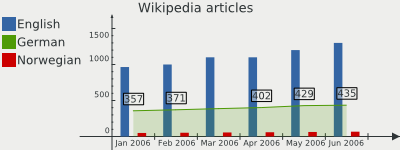 Bar chart rendering options
Pie chart rendering options
- <?php
- require_once 'tutorial_autoload.php';
- $graph = new ezcGraphPieChart();
- $graph->palette = new ezcGraphPaletteEzRed();
- $graph->title = 'Access statistics';
- $graph->legend = false;
- $graph->data['Access statistics'] = new ezcGraphArrayDataSet( array(
- 'Mozilla' => 19113,
- 'Explorer' => 10917,
- 'Opera' => 1464,
- 'Safari' => 652,
- 'Konqueror' => 474,
- ) );
- $graph->data['Access statistics']->highlight['Explorer'] = true;
- // $graph->renderer = new ezcGraphRenderer2d();
- $graph->renderer->options->moveOut = .2;
- $graph->renderer->options->pieChartOffset = 63;
- $graph->renderer->options->pieChartGleam = .3;
- $graph->renderer->options->pieChartGleamColor = '#FFFFFF';
- $graph->renderer->options->pieChartGleamBorder = 2;
- $graph->renderer->options->pieChartShadowSize = 5;
- $graph->renderer->options->pieChartShadowColor = '#BABDB6';
- $graph->render( 400, 150, 'tutorial_pie_chart_options.svg' );
- ?>
One of the pie chart specific options is moveOut in line 21, which defines how much space in the pie chart is used to move the pie chart segments out from the center when highlighted. The pieChartOffset setting in line 23 defines the initial angle for the pie chart segments, which enables you to rotate the pie chart.
In lines 25 to 27, a gleam on the pie chart is defined, with a transparency value in line 25 (which disables the gleam when set to 0), a color in line 26 and the distance from the outer border of the pie chart in line 27.
In line 29 and 30, a shadow with custom offset and color is added to the pie chart.
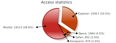 Pie chart rendering options
Pimp my chart
- <?php
- require_once 'tutorial_autoload.php';
- $graph = new ezcGraphPieChart();
- $graph->palette = new ezcGraphPaletteBlack();
- $graph->title = 'Access statistics';
- $graph->options->label = '%2$d (%3$.1f%%)';
- $graph->data['Access statistics'] = new ezcGraphArrayDataSet( array(
- 'Mozilla' => 19113,
- 'Explorer' => 10917,
- 'Opera' => 1464,
- 'Safari' => 652,
- 'Konqueror' => 474,
- ) );
- $graph->data['Access statistics']->highlight['Explorer'] = true;
- // $graph->renderer = new ezcGraphRenderer2d();
- $graph->renderer->options->moveOut = .2;
- $graph->renderer->options->pieChartOffset = 63;
- $graph->renderer->options->pieChartGleam = .3;
- $graph->renderer->options->pieChartGleamColor = '#FFFFFF';
- $graph->renderer->options->pieChartGleamBorder = 2;
- $graph->renderer->options->pieChartShadowSize = 3;
- $graph->renderer->options->pieChartShadowColor = '#000000';
- $graph->renderer->options->legendSymbolGleam = .5;
- $graph->renderer->options->legendSymbolGleamSize = .9;
- $graph->renderer->options->legendSymbolGleamColor = '#FFFFFF';
- $graph->renderer->options->pieChartSymbolColor = '#BABDB688';
- $graph->render( 400, 150, 'tutorial_pie_chart_pimped.svg' );
- ?>
Aside from the gleam added in the last example, you can define a gleam for the legend symbols. In line 32, the transparency of the gleam is defined, followed by the size of the gleam. The gleam works for all symbol types except the circle, where a gleam is not appropriate. The size setting defines the size of the gleam as a percentage of the symbol size. In the last step in line 34, the gleam color is defined.
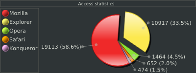 Pimped 2D pie chart
3D renderer
The three-dimensional renderer can render all charts that the 2D renderer can do, and uses all the drivers that the 2D renderer uses. The only difference is that it generates isometric three-dimensional views on the data instead of simple two-dimensional views.
- <?php
- require_once 'tutorial_autoload.php';
- $graph = new ezcGraphPieChart();
- $graph->title = 'Access statistics';
- $graph->data['Access statistics'] = new ezcGraphArrayDataSet( array(
- 'Mozilla' => 19113,
- 'Explorer' => 10917,
- 'Opera' => 1464,
- 'Safari' => 652,
- 'Konqueror' => 474,
- ) );
- $graph->data['Access statistics']->highlight['Opera'] = true;
- $graph->renderer = new ezcGraphRenderer3d();
- $graph->render( 400, 150, 'tutorial_renderer_3d.svg' );
- ?>
This examples uses the same code as the first example, except for the renderer in line 17. You can use the 3D renderer with all of the above examples by adding this single line.
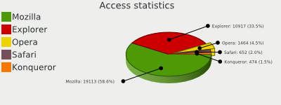 Simple 3d pie chart
3D pie charts
The options in the 2D renderer example still work, and we extend the example with some 3D renderer-specific options.
- <?php
- require_once 'tutorial_autoload.php';
- $graph = new ezcGraphPieChart();
- $graph->palette = new ezcGraphPaletteEzRed();
- $graph->title = 'Access statistics';
- $graph->options->label = '%2$d (%3$.1f%%)';
- $graph->data['Access statistics'] = new ezcGraphArrayDataSet( array(
- 'Mozilla' => 19113,
- 'Explorer' => 10917,
- 'Opera' => 1464,
- 'Safari' => 652,
- 'Konqueror' => 474,
- ) );
- $graph->data['Access statistics']->highlight['Explorer'] = true;
- $graph->renderer = new ezcGraphRenderer3d();
- $graph->renderer->options->moveOut = .2;
- $graph->renderer->options->pieChartOffset = 63;
- $graph->renderer->options->pieChartGleam = .3;
- $graph->renderer->options->pieChartGleamColor = '#FFFFFF';
- $graph->renderer->options->pieChartShadowSize = 5;
- $graph->renderer->options->pieChartShadowColor = '#000000';
- $graph->renderer->options->legendSymbolGleam = .5;
- $graph->renderer->options->legendSymbolGleamSize = .9;
- $graph->renderer->options->legendSymbolGleamColor = '#FFFFFF';
- $graph->renderer->options->pieChartSymbolColor = '#55575388';
- $graph->renderer->options->pieChartHeight = 5;
- $graph->renderer->options->pieChartRotation = .8;
- $graph->render( 400, 150, 'tutorial_pie_chart_3d.svg' );
- ?>
The pieChartGleamBorder option was removed, because it looks a bit strange on 3D pie charts, although it would still work. In lines 37 and 38, there are two new options, which configure the 3D effect of the pie chart. The first one defines the height of the pie and the second one defines the percent shrinkage compared to the maximum possible vertical size of the pie chart.
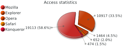 Pimped 3D pie chart
3D bar charts
3D bar charts use the symbol of the dataset as the basic shape for the rendered bar, so that you can render cylinders or cuboids in your charts.
- <?php
- require_once 'tutorial_autoload.php';
- $wikidata = include 'tutorial_wikipedia_data.php';
- $graph = new ezcGraphBarChart();
- $graph->palette = new ezcGraphPaletteEz();
- $graph->title = 'Wikipedia articles';
- // Add data
- foreach ( $wikidata as $language => $data )
- {
- $graph->data[$language] = new ezcGraphArrayDataSet( $data );
- }
- $graph->data['English']->symbol = ezcGraph::NO_SYMBOL;
- $graph->data['German']->symbol = ezcGraph::BULLET;
- $graph->data['Norwegian']->symbol = ezcGraph::DIAMOND;
- $graph->renderer = new ezcGraphRenderer3d();
- $graph->renderer->options->legendSymbolGleam = .5;
- $graph->renderer->options->barChartGleam = .5;
- $graph->render( 400, 150, 'tutorial_bar_chart_3d.svg' );
- ?>
The symbols for these examples are set as described earlier in this tutorial. Two single options are set to improve the displayed image. legendSymbolGleam is activated with the default color, and barChartGleam is activated to get more beautiful bars. You could optionally darken the tops and sides of the bars using the options barDarkenSide and barDarkenTop.
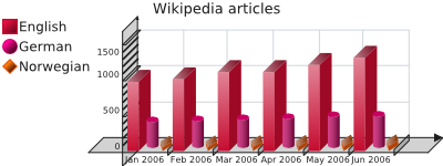 Pimped 3D bar chart
3D line charts
The line chart example with the 3D renderer is again quite simple. It reuses the example with the statistical data and the approximated polygon.
- <?php
- require_once 'tutorial_autoload.php';
- $graph = new ezcGraphLineChart();
- $graph->title = 'Some random data';
- $graph->legend->position = ezcGraph::BOTTOM;
- $graph->options->fillLines = 210;
- $graph->xAxis = new ezcGraphChartElementNumericAxis();
- $data = array();
- for ( $i = 0; $i <= 10; $i++ )
- {
- $data[$i] = mt_rand( -5, 5 );
- }
- // Add data
- $graph->data['random data'] = $dataset = new ezcGraphArrayDataSet( $data );
- $average = new ezcGraphDataSetAveragePolynom( $dataset, 3 );
- $graph->data[(string) $average->getPolynom()] = $average;
- $graph->renderer = new ezcGraphRenderer3d();
- $graph->render( 400, 150, 'tutorial_line_chart_3d.svg' );
- ?>
Again, the only thing that has changed is the use of the 3D renderer and the fillLines option (to show that it works for 3D charts as well).
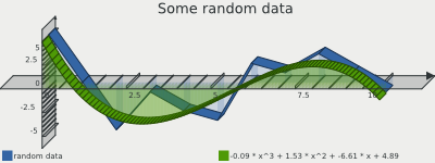 3D line chart example
Drivers
The driver gets the image primitives from the renderer and creates the final image. Different drivers can be used depending on the available extensions and the desired output format.
There are some driver-specific options described below. You can also learn about them in the API documentation for each driver.
SVG driver
The default driver generates an SVG image, a standardized XML vector graphic format, which most of the modern browsers can display natively, except for Internet Explorer. Even with Internet Explorer, there are several plugins available from Corel [1] , or Adobe [2] , which enable the browser to render SVGs. There are several advantages in using the SVG driver. The XML documents can easily be modified later, and compressed effectively. The driver is very fast, and all shapes are displayed exactly and anti aliased. You can define templates, using an existing SVG document, where the generated chart is added to a dedicated group; you can then configure all rendering options of the SVG document. The example below shows such a template created with Inkscape and a simple pie chart rendered using this template.
- <?php
- require_once 'tutorial_autoload.php';
- $graph = new ezcGraphPieChart();
- $graph->background->color = '#FFFFFFFF';
- $graph->title = 'Access statistics';
- $graph->legend = false;
- $graph->data['Access statistics'] = new ezcGraphArrayDataSet( array(
- 'Mozilla' => 19113,
- 'Explorer' => 10917,
- 'Opera' => 1464,
- 'Safari' => 652,
- 'Konqueror' => 474,
- ) );
- $graph->renderer = new ezcGraphRenderer3d();
- $graph->renderer->options->pieChartShadowSize = 10;
- $graph->renderer->options->pieChartGleam = .5;
- $graph->renderer->options->dataBorder = false;
- $graph->renderer->options->pieChartHeight = 16;
- $graph->renderer->options->legendSymbolGleam = .5;
- $graph->driver->options->templateDocument = dirname( __FILE__ ) . '/template.svg';
- $graph->driver->options->graphOffset = new ezcGraphCoordinate( 25, 40 );
- $graph->driver->options->insertIntoGroup = 'ezcGraph';
- $graph->render( 400, 200, 'tutorial_driver_svg.svg' );
- ?>
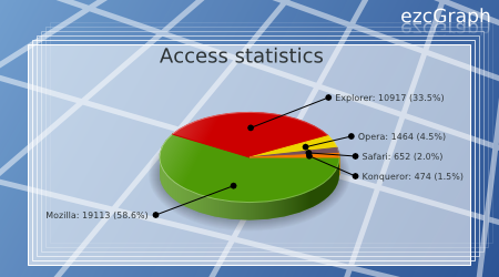 SVG driver example with template
The only drawback of SVG is that it is impossible to determine or define the exact width of text strings. As a result, the driver can only estimate the size of text in the resulting image, which will sometimes fail slightly. Since the 1.3 (2008.1) release you can work around this issue, by using the Glyph support.
- 1
- Abobe SVG plugin: http://www.adobe.com/svg/viewer/install/main.html
- 2
- Corel SVG plugin: http://www.corel.com/servlet/Satellite?pagename=CorelCom/Layout&c=Content_C1&cid=1152796555406&lc=en
Glyph support
Since version 1.3 (2008.1) you may set a SVG font to be used by the SVG driver, which will result in exact text width estimation using glyphs for the chracters in texts. SVG fonts may be created from TTF fonts using the ttf2svg command available in the apache batik package.
Embedding SVG in HTML
If you want to embed SVGs in HTML there are several ways to do so. With XHTML you may inline the content of the SVG in your HTML, as both are just XML. You need to keep correct namespacing in mind here. Opera and Firefox will support this technique.
Another way to reference SVGs in your HTML markup, is to use the object element like following example shows.
<object data="path/to/image.svg" type="image/svg+xml">
        You need a browser capeable of SVG to display this image.
</object>
You can optionally specify the width and height as attributes in the options element. With this standards-conforming method, the drawback is that Microsoft Internet Explorer does not support this. With browsers from the Internet Explorer series, you can use the proprietary embed element.
<embed src="path/to/image.svg"></embed>You cannot specify an alternative text here, and this will not work with Opera and Firefox. If you need to support all browsers, you can use one of the common switches to distinguish between browsers.
<!--[if IE]>
        <embed ... />
<![endif]-->
<![if !IE]-->
        <object ... />
<![endif]-->
Another alternative for embedding SVGs in your HTML would be to use iframes.
GD driver
The GD driver is one of the choices for generating bitmap images. It supports different font types, if available in your PHP installation, like True Type Fonts (using the FreeType 2 library or native TTF support) and PostScript Type 1 fonts. We use super sampling to enable basic anti aliasing in the GD driver, where the image is rendered twice as big and resized back to the requested size. This is used for all image primitives except text and images.
There are some drawbacks in the GD library that we have not been able to overcome:
Transparent pie segments look very strange with GD
There is no native support for gradients in GD
Font anti aliasing depends on the font extension. Use the FreeType 2 library if available, which is the default behavior.
There are some special configuration options for the GD driver. You can specify the super sampling rate used, and use different output formats (if available with your bundled GD extension) as shown in lines 13 to 15 in the following example.
- <?php
- require_once 'tutorial_autoload.php';
- $graph = new ezcGraphPieChart();
- $graph->palette = new ezcGraphPaletteEzGreen();
- $graph->title = 'Access statistics';
- $graph->legend = false;
- $graph->driver = new ezcGraphGdDriver();
- $graph->options->font = 'tutorial_font.ttf';
- // Generate a Jpeg with lower quality. The default settings result in a image
- // with better quality.
- //
- // The reduction of the supersampling to 1 will result in no anti aliasing of
- // the image. JPEG is not the optimal format for grapics, PNG is far better for
- // this kind of images.
- $graph->driver->options->supersampling = 1;
- $graph->driver->options->jpegQuality = 100;
- $graph->driver->options->imageFormat = IMG_JPEG;
- $graph->data['Access statistics'] = new ezcGraphArrayDataSet( array(
- 'Mozilla' => 19113,
- 'Explorer' => 10917,
- 'Opera' => 1464,
- 'Safari' => 652,
- 'Konqueror' => 474,
- ) );
- $graph->render( 400, 200, 'tutorial_driver_gd.jpg' );
- ?>
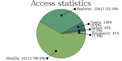 GD driver example jpeg
Cairo driver
Cairo is a software library used to provide a vector graphics-based, device-independent API for software developers. It is designed to provide primitives for 2-dimensional drawing across a number of different backends. Cairo is designed to use hardware acceleration when available.
Using the PHP extension pecl/cairo_wrapper and the driver class ezcGraphCairoDriver you can also create bitmaps with a far better quality then the GD driver, supporting all features required by the graph components with high quality anti aliasing.
- <?php
- require_once 'tutorial_autoload.php';
- $graph = new ezcGraphPieChart();
- $graph->palette = new ezcGraphPaletteEzBlue();
- $graph->title = 'Access statistics';
- $graph->legend = false;
- // Set the cairo driver
- $graph->driver = new ezcGraphCairoDriver();
- $graph->data['Access statistics'] = new ezcGraphArrayDataSet( array(
- 'Mozilla' => 19113,
- 'Explorer' => 10917,
- 'Opera' => 1464,
- 'Safari' => 652,
- 'Konqueror' => 474,
- ) );
- $graph->renderer = new ezcGraphRenderer3d();
- $graph->renderer->options->pieChartGleam = .3;
- $graph->renderer->options->pieChartGleamColor = '#FFFFFF';
- $graph->renderer->options->pieChartShadowSize = 5;
- $graph->renderer->options->pieChartShadowColor = '#000000';
- $graph->renderer->options->legendSymbolGleam = .5;
- $graph->renderer->options->legendSymbolGleamSize = .9;
- $graph->renderer->options->legendSymbolGleamColor = '#FFFFFF';
- $graph->renderer->options->pieChartSymbolColor = '#55575388';
- $graph->renderer->options->pieChartHeight = 5;
- $graph->renderer->options->pieChartRotation = .8;
- $graph->render( 400, 300, 'tutorial_driver_cairo.png' );
- ?>
 Cairo driver example jpeg
Ming/Flash driver
ezcGraph can use ext/ming to generate Flash swf files. This driver only supports Palm Format Fonts (.fdb) and can only handle a very small subset of JPEGs as images for the chart background. On the other hand, Flash is a vector graphic format, so the images are rather small and can be compressed effectively. The font size estimation is exact and it support gradients and all of the used shapes. Ming does not support the generation of swf files using transparent backgrounds.
- <?php
- require_once 'tutorial_autoload.php';
- $graph = new ezcGraphPieChart();
- $graph->title = 'Access statistics';
- $graph->legend = false;
- $graph->driver = new ezcGraphFlashDriver();
- $graph->options->font = 'tutorial_font.fdb';
- $graph->driver->options->compression = 7;
- $graph->data['Access statistics'] = new ezcGraphArrayDataSet( array(
- 'Mozilla' => 19113,
- 'Explorer' => 10917,
- 'Opera' => 1464,
- 'Safari' => 652,
- 'Konqueror' => 474,
- ) );
- $graph->renderer = new ezcGraphRenderer3d();
- $graph->renderer->options->pieChartShadowSize = 10;
- $graph->renderer->options->pieChartGleam = .5;
- $graph->renderer->options->dataBorder = false;
- $graph->renderer->options->pieChartHeight = 16;
- $graph->renderer->options->legendSymbolGleam = .5;
- $graph->render( 400, 200, 'tutorial_driver_flash.swf' );
- ?>
The Ming driver does not have a lot of available options. You need to use a valid font file, as in line 10, and you can set the compression rate used by the Ming driver to compress the resulting swf. The result is a beautiful Flash image.
Element references
Description
Element references describe a mechanism to modify and reference certain chart elements to add links, menus or other interactive features in your application. The type of the references depend on the driver you use to render charts. The GD driver will return points describing polygons, so that you can generate image maps from the data, while the SVG driver will return the IDs of XML elements.
Element references are created in the renderer. This way it is also possible to reference legend symbols and text, data labels and of course the actual data elements.
In ezcGraph version 1.1 and later, you can define URLs for datasets and data points that will be used when linking the elements. You now can use the function provided in ezcGraphTools to create the image maps and add links into SVG images.
SVG example
- <?php
- require_once 'tutorial_autoload.php';
- $graph = new ezcGraphPieChart();
- $graph->palette = new ezcGraphPaletteEz();
- $graph->title = 'Access statistics';
- $graph->data['Access statistics'] = new ezcGraphArrayDataSet( array(
- 'Mozilla' => 19113,
- 'Explorer' => 10917,
- 'Opera' => 1464,
- 'Safari' => 652,
- 'Konqueror' => 474,
- ) );
- $graph->data['Access statistics']->url = 'http://example.org/';
- $graph->data['Access statistics']->url['Mozilla'] = 'http://example.org/mozilla';
- $graph->render( 400, 200, 'tutorial_reference_svg.svg' );
- $graph->driver->options->linkCursor = 'crosshair';
- ezcGraphTools::linkSvgElements( $graph );
- ?>
In ezcGraph version 1.1 and later, you can optionally set a custom cursor type used by the browser to indicate that you can click on a surface. The cursor defaults to a pointer normally used for links. You also need to assign URLs to the datasets or data points, as in the lines 17 and 18, and then call ezcGraphTools::linkSvgElements (line 23) to modify your SVG. The result will be a clickable SVG image.
GD example
In the case of GD we want to generate an image map instead of modifying the generated image. The driver returns polygons described by their edge coordinates, which you can use to generate an image map.
- <?php
- require_once 'tutorial_autoload.php';
- $graph = new ezcGraphPieChart();
- $graph->palette = new ezcGraphPaletteEzGreen();
- $graph->title = 'Access statistics';
- $graph->driver = new ezcGraphGdDriver();
- $graph->options->font = 'tutorial_font.ttf';
- $graph->data['Access statistics'] = new ezcGraphArrayDataSet( array(
- 'Mozilla' => 19113,
- 'Explorer' => 10917,
- 'Opera' => 1464,
- 'Safari' => 652,
- 'Konqueror' => 474,
- ) );
- $graph->data['Access statistics']->url = 'http://example.org/';
- $graph->data['Access statistics']->url['Mozilla'] = 'http://example.org/mozilla';
- $graph->render( 400, 200, 'tutorial_reference_gd.png' );
- ?>
- <html>
- <head><title>Image map example</title></head>
- <body>
- <?php
- echo ezcGraphTools::createImageMap( $graph, 'GraphPieChartMap' );
- ?>
- <img
- src="tutorial_reference_gd.png"
- width="400" height="200"
- usemap="#GraphPieChartMap" />
- </body>
- </html>
- <?php
- ?>
In line 20 we associate a URL to the complete dataset and in line 21 another URL for the Mozilla data point only. Those URLs will be used to create the image map in line 31. In the second parameter on line 31 we can provide a name for the image map, which should be used to associate the image map to the image in line 37. The result is a linked legend and linked pie chart in your generated bitmap.
SVG to bitmap conversion
If you want to benefit from the more beautiful SVG output you can convert the vector graphics to a bitmap format, like PNG or JPEG, on the server side. There are several tools than can do this, but for each you need to be able to execute commands using the exec() function family.
librsvg Small memory footprint and advanced SVG support, including filters (which are not used by ezcGraph, though). Example command to convert an image:
rsvg input.svg output.pngImageMagick Installed on most servers, but has some issues with transparent backgrounds in SVG documents. Example command with ImageMagick:
convert -background none input.svg output.pngInkscape Not available on most servers, but perfect for modifying SVG documents on Unix and Windows. Requires X to install, but can be run on CLI, too:
inkscape input.svg -e output.png
All three converters can also export to PDF or postscript, and resize the document if desired. For further details, please read the documentation of the respective tool.
Direct output
By default, a graph is rendered to a file, as you normally want to cache generated images. ezcGraph also provides a method for the direct output of generated charts. Use this with caution.
The ezcGraph::renderToOutput() method sends the correct Content-Type header for the selected output driver and writes the chart's image data directly to output. Do not output anything before using this method.
- <?php
- require_once 'tutorial_autoload.php';
- $graph = new ezcGraphPieChart();
- $graph->title = 'Access statistics';
- $graph->data['Access statistics'] = new ezcGraphArrayDataSet( array(
- 'Mozilla' => 19113,
- 'Explorer' => 10917,
- 'Opera' => 1464,
- 'Safari' => 652,
- 'Konqueror' => 474,
- ) );
- $graph->data['Access statistics']->highlight['Opera'] = true;
- $graph->renderToOutput( 400, 150 );
- ?>
This example renders the first graph of this tutorial.
More information
For more information, see the ezcGraph API documentation.